This story originally aired on May 25, 2019.
When most of us see scientific data presented on graphs and spreadsheets, the meaning behind the numbers can get lost pretty fast — even when they are explained by an expert.
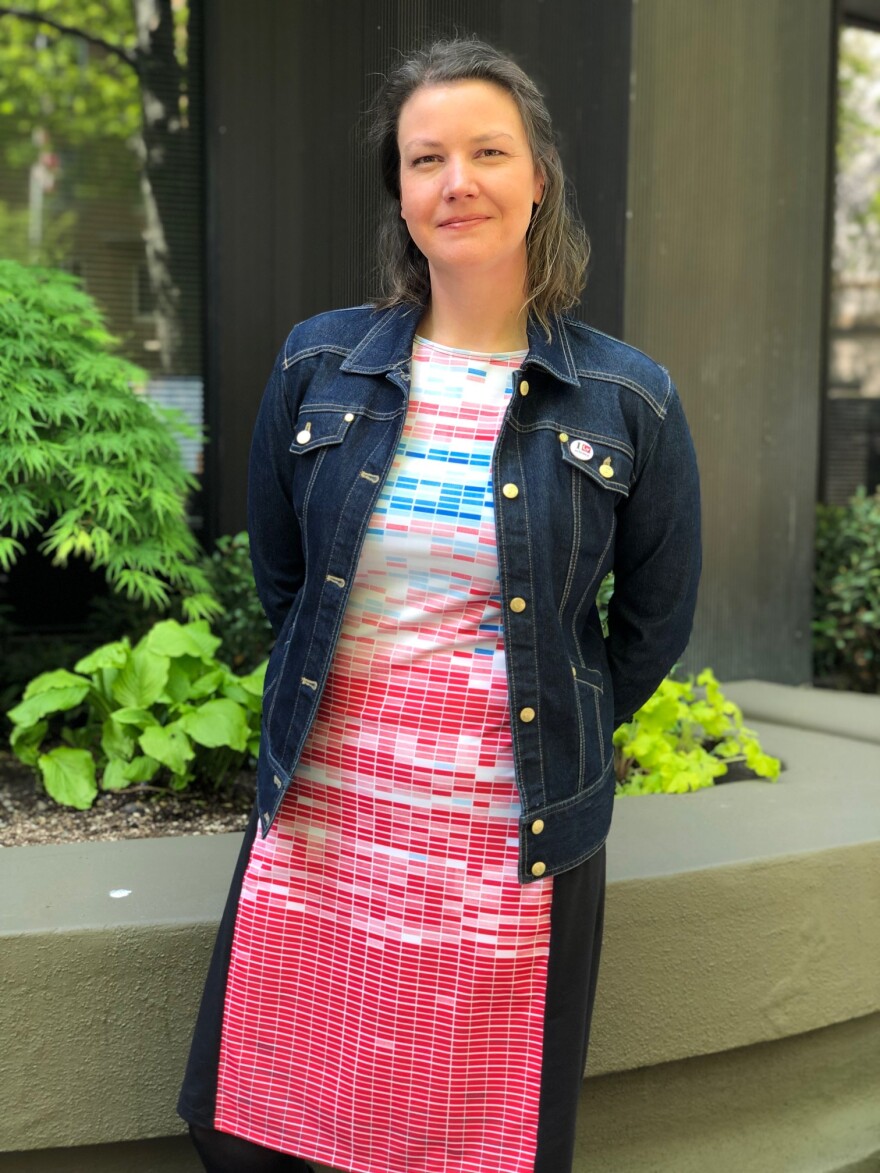
One woman whose personal mission is to make this kind of information more accessible is Judy Twedt, a doctoral student at the University of Washington. She is so enthusiastic about communicating scientific information in an understandable way that she wears it for everyone to see.

When she visited the KNKX studios, Twedt's dress displayed climate data through color — little blocks of varying shades of blue and red. Each block represents a month. These blocks literally display the history of our warming planet from the 1800s to today.
Twedt grew up in Tacoma, exploring the coast and swimming in the cold waters of Puget Sound. Her love for this part of the world — and how it’s being affected by climate change — is one of the reasons why she wanted to pursue her Ph.D. in atmospheric science at UW.
At the university, Twedt started teaching a class for undergraduates who didn't know anything about the science and physics of global warming.
“You know, we’d show the NASA record of global surface temperature and I’d want to say, ‘Hey, this graph is really important, right? If you remember anything, here’s the data you can talk about if you’re having this conversation with your friends or family. And you know because you’ve seen the numbers that global temperature is rising,’" Twedt said. "And yet it all got lost, it all got muddied because there’s just so much visual information."
In this story, we’ll learn how Twedt tapped her musical side to help better communicate the story that climate data has to tell us.


